
Returns the tidy data.frame that plot() draws for a given type, so the
underlying series, weights, or placebo paths can be inspected, joined into a
table, or re-plotted directly. plot() stays the quick path; plot_data()
is the handle for anyone who wants to relabel simplified series names, feed
the numbers into their own figure, or postprocess them further.
Usage
plot_data(x, ...)

# Default S3 method
plot_data(x, ...)

# S3 method for class 'coresynth'
plot_data(
  x,
  type = c("trend", "gap", "weights", "pred_weights"),
  align = FALSE,
  top_n = Inf,
  show_donors = 0,
  ...
)

# S3 method for class 'scm_placebo'
plot_data(x, type = c("gaps", "ratios"), mspe_prune = NULL, ...)

# S3 method for class 'sdid_event_study'
plot_data(x, ci_type = NULL, ...)
Arguments
- x
A
coresynthfit (fromscm_fit()), ascm_placeboobject (frommspe_ratio_pval()), or asdid_event_studyobject (fromsdid_event_study()).- ...
Passed to methods (unused by the current methods).
- type
For a
coresynthfit: one of"trend","gap","weights", or"pred_weights", matchingplot.coresynth(). For ascm_placeboobject:"gaps"or"ratios", matchingplot.scm_placebo().- align
For
type = "trend"/"gap": whenTRUE, shift the synthetic series by its pre-treatment level gap to the treated series, exactly as inplot.coresynth(). DefaultFALSE(raw series).- top_n
For
type = "weights"/"pred_weights": keep only thetop_nlargest weights (defaultInf, every row).- show_donors
For
type = "trend": also return the outcome paths of theshow_donorslargest-weight donors asseries = "Donors"rows, adding aunitcolumn that identifies each donor (NAfor the treated and synthetic series). Default0(treated and synthetic series only).- mspe_prune
For a
scm_placeboobject: drop placebo units whose pre-treatment MSPE exceedsmspe_prunetimes the treated unit's, as inplot.scm_placebo().NULL(default) reuses the cutoffmspe_ratio_pval()computed the p-value under;Infkeeps every run.- ci_type
For a
sdid_event_studyobject: which confidence interval ("normal"or"percentile") fillsconf.low/conf.high, as inplot.sdid_event_study().NULL(default) uses the object'sci_type.
Value
A tidy data.frame. Columns by type:
"trend"time,value,series("Treated"/"Synthetic Control"); withshow_donors > 0, also"Donors"rows and aunitcolumn."gap"time,gap(treated minus synthetic control)."weights"unit,weight; SDID fits add apanelcolumn ("omega"unit weights,"lambda"time weights), withunitholding the pre-period label for"lambda"rows."pred_weights"predictor,weight(sharp SCM only)."gaps"time,gap,unit(NAfor the treated series),series("Treated"/"Placebo (donor pool)")."ratios"unit,ratio,post_mspe,series– both candidate statistics, so the frame answers eithermspe_ratio_pval()statistic.
Details
The frame mirrors what the matching plot(x, type = ...) call shows, with
two deliberate departures that make it a better data source:
Plain column names (
time,value,series,weight, ...) are used instead of the dotted convention ofaugment(), since this is data to manipulate rather than model-augmented observations.The cosmetic "drop donors with weight below 1e-4" filter that
plot(type = "weights")applies is not used here: every donor is returned (usetop_nto subset), so the frame is the complete set of weights.
Only the arguments that change which rows or values appear are accepted
(align, top_n, show_donors, mspe_prune); purely cosmetic arguments
of plot() (colors, labels, linetypes, vline, fill, ...) have no
data counterpart and are not part of this interface.
Examples
set.seed(1)
panel <- expand.grid(unit = 1:10, year = 1:20)
panel$treated <- as.integer(panel$unit == 5 & panel$year > 15)
panel$gdp <- panel$unit + 0.5 * panel$year +
rnorm(nrow(panel)) + 3 * panel$treated
fit <- scm_fit(gdp ~ treated | unit + year, data = panel, method = "scm")
#> predictors = NULL: using the outcome in each of the 15 pre-treatment periods as predictors (outcomes-only SCM).
head(plot_data(fit, type = "trend"))
#> time value series
#> 1 1 5.829508 Treated
#> 2 2 7.124931 Treated
#> 3 3 7.119826 Treated
#> 4 4 5.622940 Treated
#> 5 5 6.811244 Treated
#> 6 6 9.433024 Treated
plot_data(fit, type = "gap")
#> time gap
#> 1 1 0.6895921
#> 2 2 1.1159125
#> 3 3 0.6390309
#> 4 4 -1.4100205
#> 5 5 -0.3980468
#> 6 6 1.0245220
#> 7 7 -0.8092773
#> 8 8 -1.1202163
#> 9 9 0.3574866
#> 10 10 1.2544399
#> 11 11 -0.9003648
#> 12 12 -0.2251279
#> 13 13 -0.3514409
#> 14 14 1.0777844
#> 15 15 -0.4915183
#> 16 16 2.3231805
#> 17 17 1.8074580
#> 18 18 2.4651749
#> 19 19 3.4619856
#> 20 20 2.1604175
plot_data(fit, type = "weights")
#> unit weight
#> 1 1 0.000000000
#> 2 2 0.295683846
#> 3 3 0.208534950
#> 4 4 0.000000000
#> 5 6 0.272339762
#> 6 7 0.003504345
#> 7 8 0.000000000
#> 8 9 0.219937098
#> 9 10 0.000000000
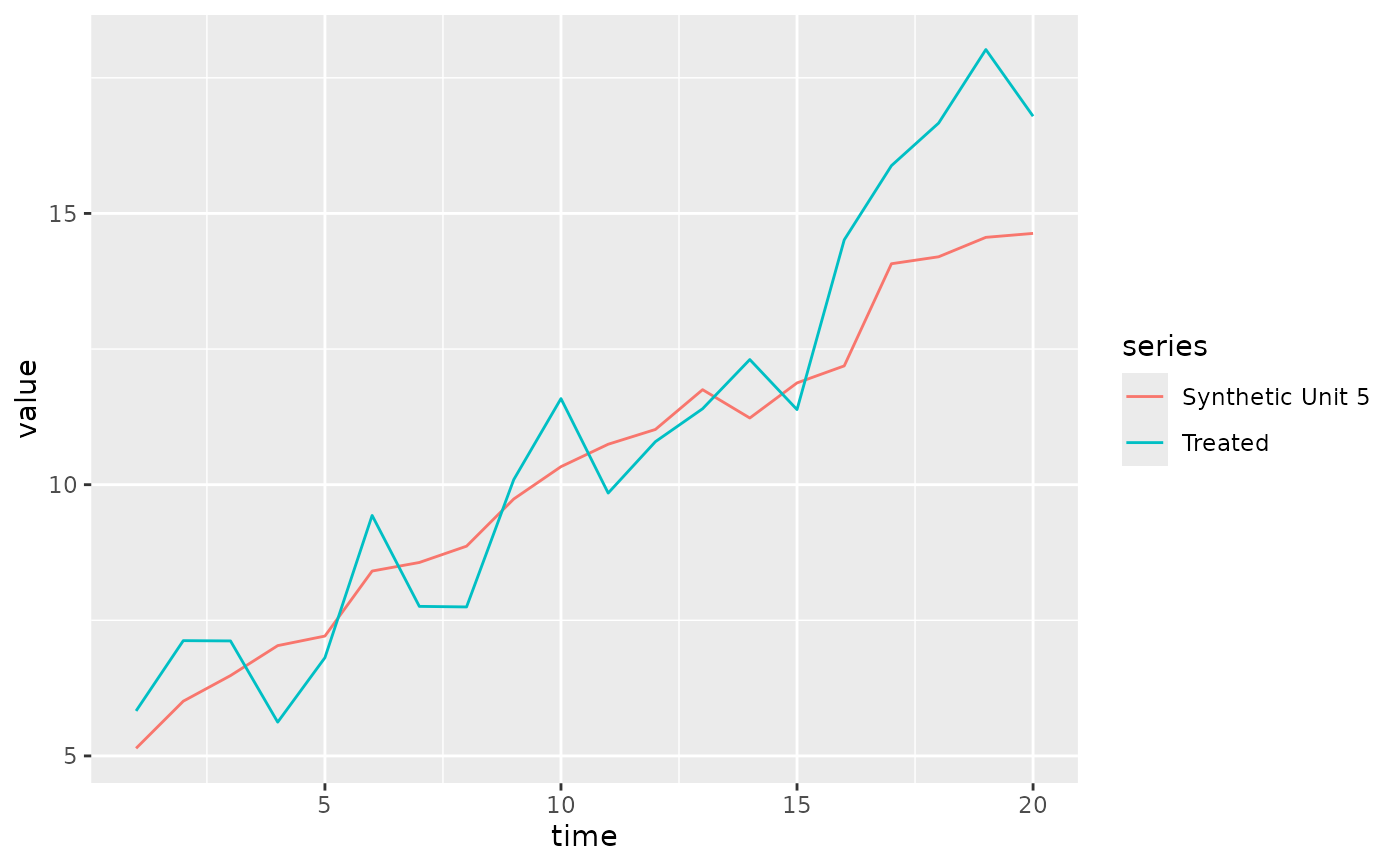
# Relabel the simplified series names, then plot it yourself
df <- plot_data(fit, type = "trend")
df$series <- sub("Synthetic Control", "Synthetic Unit 5", df$series)
# \donttest{
ggplot2::ggplot(df, ggplot2::aes(time, value, color = series)) +
ggplot2::geom_line()
 # }
# }