Introduction
The fixes package provides an easy-to-use toolkit
for estimating and visualizing difference-in-differences designs on
panel data: event-study curves via event_study(),
aggregated ATT via att(), and basic two-way fixed-effects
DiD via did(). Every result has a base plot()
method, so a complete analysis is a two-line pipeline.
Estimation runs on the package’s internal C++ fixed-effects OLS
engine; the fixest package is an optional dependency (used
only in this vignette for its example datasets and a few advanced
specifications).
Upgrading from fixes < 1.0.0? The old verb-style functions (
run_es(),calc_att(),run_did(),plot_es(), …) still work and return identical results, but are deprecated. This vignette uses the new noun-style API introduced in 1.0.0.
Installation
Install the released version from CRAN:
install.packages("fixes")Or with pak (recommended for fast install):
pak::pak("fixes")To install the latest development version from GitHub:
pak::pak("yo5uke/fixes")Minimal Example
Below is a basic example using the built-in
fixest::base_did dataset, running an event study, and
visualizing the results.
# Load example data
df <- fixest::base_did

# Run the event study (supports multiple confidence levels)
es <- event_study(
  y ~ treat | id + period,
  data       = df,
  time       = period,
  timing     = 5,  # Treatment occurs at period 5 (universal timing)
  cluster    = ~ id,
  baseline   = -1,
  interval   = 1,
  lead_range = 3,
  lag_range  = 3,
  conf_level = c(0.90, 0.95, 0.99)  # Multiple CIs supported!
)

# View results
head(es)
#> Event Study Result (fixes)
#>   N: 1080  | Units: 108  | Treated units: 55  | Never-treated: 53
#>   Panel: unit = id | time = period
#>   FE: id + period
#>   VCOV: cluster  | Cluster: id
#>   Estimator: twfe
#>   Method: classic  | lead_range: 3  lag_range: 3  baseline: -1
The model is written as in fixest::feols():
outcome ~ treatment + covariates | fixed effects. Here
treat marks the treated units and timing = 5
gives their common treatment date, so event_study() uses
the universal (non-staggered) design. The unit is read from the fixed
effects (id, the one besides time) and
reported in a message.
Specifying treatment
Describe treatment in whichever way matches your data:
| Your data has | Write |
|---|---|
| D: 1 for treated units in post-treatment periods | y ~ D + x \| id + year, time = year |
each unit’s first treated period (NA = never
treated) |
y ~ x \| id + year, time = year, timing = g |
| a treated-group dummy and one treatment date | y ~ treated + x \| id + year, time = year, timing = 2005 |
With a D column, each unit’s treatment start is the first period with
D = 1: one start date gives the universal design, several
the staggered one. With a timing column, the right-hand side holds only
covariates (y ~ 1 | id + year when there are none). The
same formula works in did() and att().
df$D <- as.integer(df$treat == 1 & df$period >= 5)
es_d <- event_study(y ~ D | id + period, data = df, time = period,
                    cluster = ~ id)
all.equal(es_d$estimate, event_study(y ~ treat | id + period, data = df,
                                     time = period, timing = 5,
                                     cluster = ~ id)$estimate)
#> [1] TRUE
Visualizing Event Study Results
Results plot directly with plot(). You can switch
between error bar and ribbon CIs, select the displayed CI level, and
customize appearance.
# Basic plot (default: error bars, 95% CI)
plot(es)
# Ribbon display with the 99% CI
plot(es, type = "ribbon", ci_level = 0.99)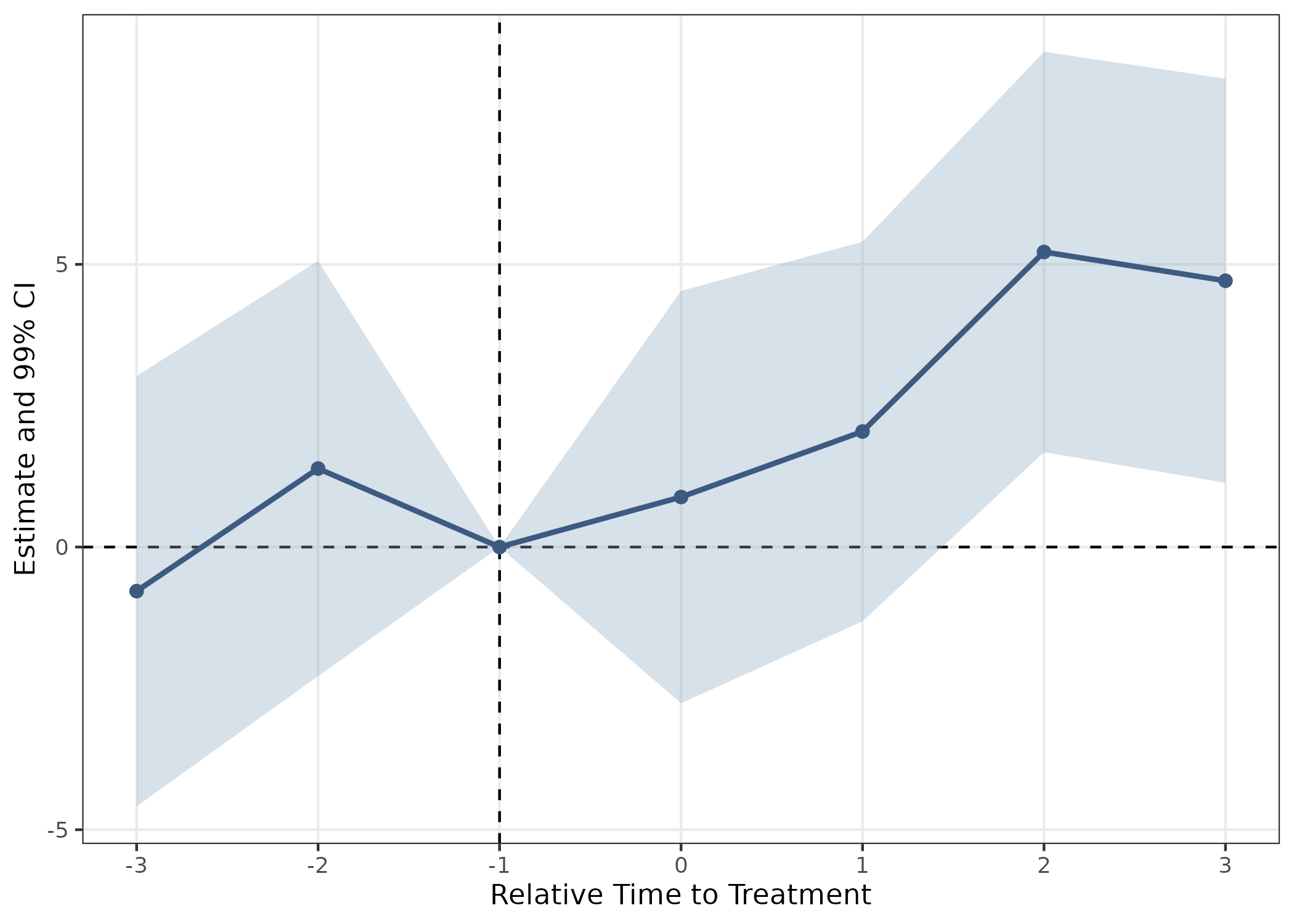
color sets the points, fill the ribbon
band, and errorbar_color the bars alone (it follows
color unless given).
# Customize further with ggplot2
plot(es, ci_level = 0.9, color = "#1B4965", errorbar_color = "grey60",
     theme_style = "classic") +
  scale_x_continuous(breaks = seq(-3, 3, by = 1)) +
  ggtitle("Event Study with 90% CI and Classic Theme")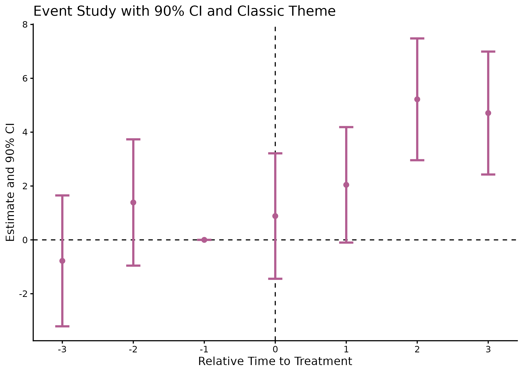
By default the horizontal axis shows event time (periods since
treatment). With time_axis = "calendar" it shows the
original time values instead, the dashed reference line moving with
it:
plot(es, time_axis = "calendar")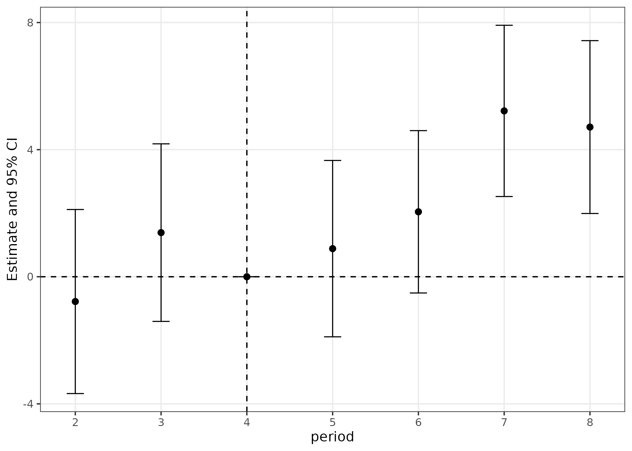
This needs a single treatment period, so it is available for universal timing (as here) but not for staggered adoption, where one relative period corresponds to a different calendar period in every cohort.
For interactive exploration with hover tooltips (estimates, CIs,
standard errors, p-values), pass interactive = TRUE
(requires the suggested plotly package):
plot(es, interactive = TRUE)Package Highlights
-
- Fast, one-step event study for panel data on an internal C++ fixed-effects engine.
- Six estimators behind one interface (
estimator =): classic TWFE, Callaway & Sant’Anna, Sun & Abraham, Borusyak-Jaravel-Spiess, Wooldridge two-way Mundlak, and Deb et al. FLEX. - One formula for the model, shared with
did()andatt(). - Automatic creation of lead/lag dummies relative to treatment, with staggered/universal timing inferred from how treatment is given.
- Covariates, clustering, weights, and flexible baseline normalization.
- Multiple confidence interval levels (e.g., 90%, 95%, 99%).
- Handles irregular time panels via
time_transform.
att(): aggregated ATT — overall, by cohort, or by calendar time — for the CS and BJS estimators, withbroom::tidy()/glance()methods.did(): single-coefficient TWFE DiD compatible withmodelsummary::modelsummary().plot(): every result class has a plot method — event-study curves, ATT point-range charts, ATT(g,t) heatmaps (plot(att_gt(x))), honest sensitivity plots, and contamination-weight heatmaps.
Staggered adoption estimators
Standard TWFE event-study regressions can produce biased and
sign-reversed estimates under heterogeneous treatment effects when units
adopt treatment at different times (Callaway & Sant’Anna 2021; Sun
& Abraham 2021; Borusyak, Jaravel & Spiess 2024).
fixes provides robust alternatives, all accessible
through the same event_study() interface via the
estimator argument.
We demonstrate three of them on fixest::base_stagg, a
simulated staggered-adoption panel with true ATT = 1 for all cohorts and
horizons.
df_stagg <- fixest::base_stagg
# Mark never-treated units with NA (convention for all staggered estimators)
df_stagg$timing <- df_stagg$year_treated
df_stagg$timing[df_stagg$year_treated == 10000] <- NA
Callaway & Sant’Anna (2021) — estimator = "cs"
Estimates a separate ATT(g,t) for every cohort-by-period cell, then aggregates to an event-study curve using cohort-size weights.
res_cs <- event_study(
  y ~ 1 | id + year,
  data          = df_stagg,
  time          = year,
  timing        = timing,
  estimator     = "cs",
  control_group = "nevertreated"
)
plot(res_cs) + ggplot2::ggtitle("Callaway & Sant'Anna (2021)")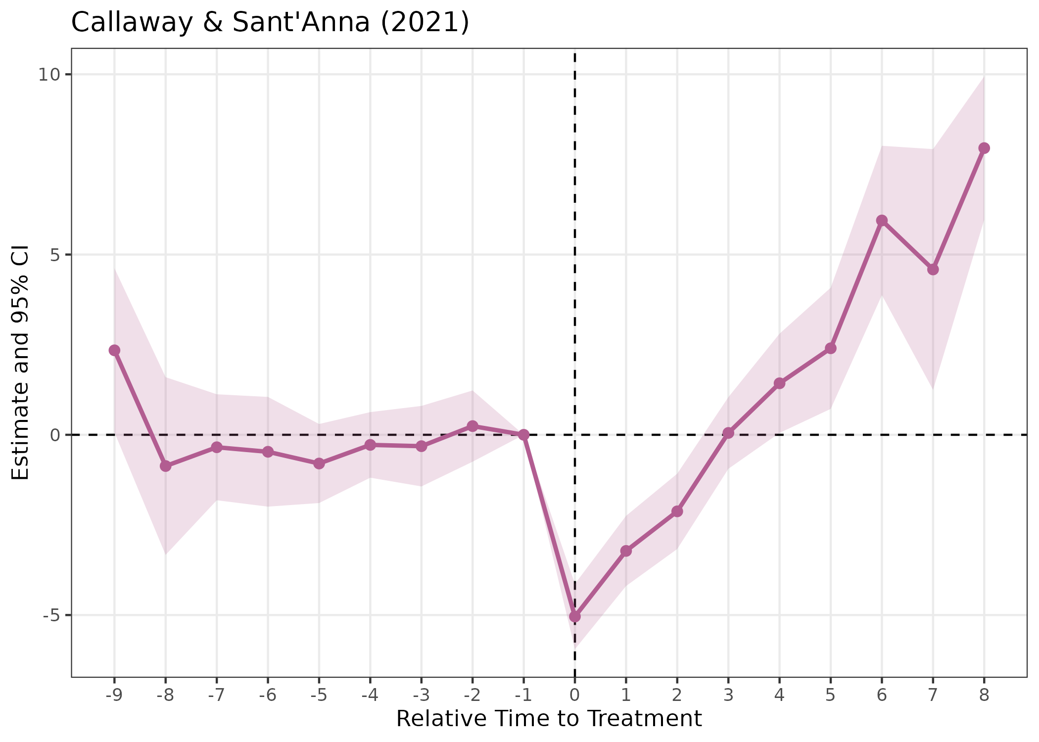
Sun & Abraham (2021) — estimator = "sa"
Builds cohort x relative-time interactions and aggregates with
cohort-share weights. Numerically identical to
fixest::sunab() (which the deprecated
run_es(method = "sunab") used directly).
res_sa <- event_study(
  y ~ 1 | id + year,
  data      = df_stagg,
  time      = year,
  timing    = timing,
  estimator = "sa",
  cluster   = ~ id
)
plot(res_sa) + ggplot2::ggtitle("Sun & Abraham (2021)")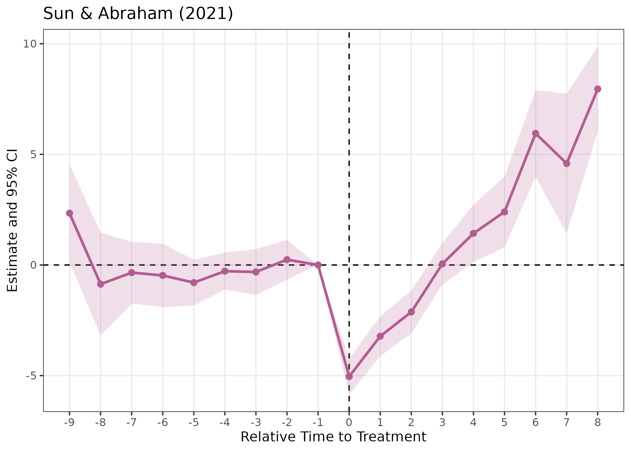
Borusyak, Jaravel & Spiess (2024) —
estimator = "bjs"
Fits TWFE on untreated observations, imputes counterfactuals for treated units, then averages by horizon.
res_bjs <- event_study(
  y ~ 1 | id + year,
  data      = df_stagg,
  time      = year,
  timing    = timing,
  estimator = "bjs"
)
plot(res_bjs) + ggplot2::ggtitle("Borusyak, Jaravel & Spiess (2024)")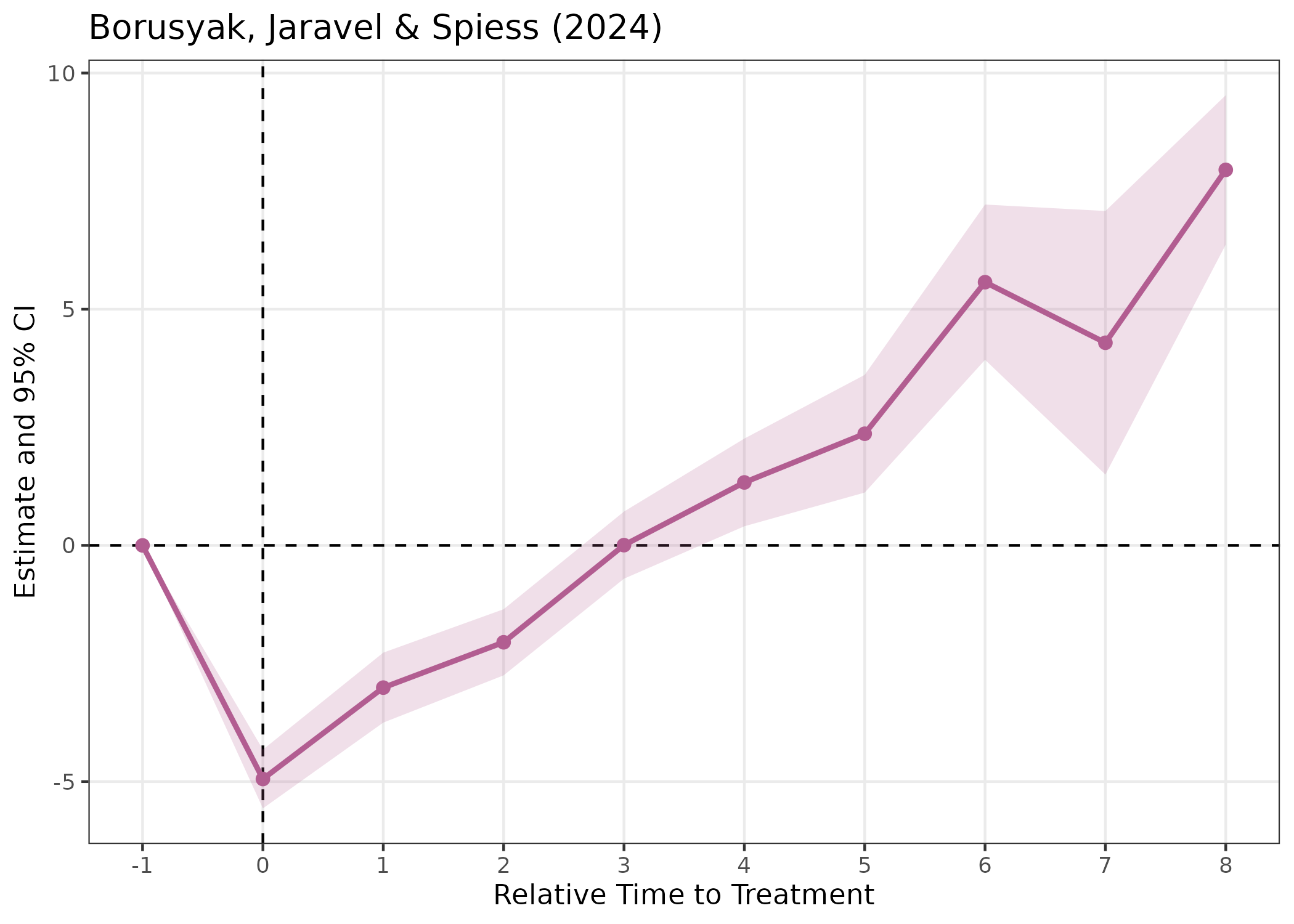
Under homogeneous treatment effects (as in this DGP), the estimators
give similar results, each recovering a post-treatment ATT close to the
true value of 1. Wooldridge’s two-way Mundlak ("twm") and
the Deb et al. FLEX estimator for repeated cross-sections
("flex") round out the set.
Aggregated ATT — att()
When you want a single number (or one per cohort / per period) instead of the full curve:
att(y ~ 1 | id + year, data = df_stagg, time = year, timing = timing,
    estimator = "cs", aggregation = "simple")
#> ATT Estimation  [estimator: CS | aggregation: Simple (overall)]
#> N = 950 obs | 95 units | 45 treated
#> Panel: unit = id | time = year
#>
#>   group estimate std.error statistic p.value conf_low_95 conf_high_95
#> 1    NA   -0.755     0.679     -1.11   0.266       -2.09        0.576
Bootstrap simultaneous confidence bands
Pointwise vs. simultaneous CIs
Standard confidence intervals are pointwise: the 95% CI at each horizon covers the true value with 95% probability, but the probability that all intervals simultaneously cover their true values can be much lower when many periods are plotted.
Simultaneous confidence bands (Callaway & Sant’Anna 2021, Corollary 1) control the joint coverage probability. With probability at least 1 − α, the entire event-study curve is contained within the simultaneous band. This is especially important for parallel-trends pre-testing: a pre-trend test based on simultaneous bands controls the family-wise error rate.
Usage
Pass bootstrap = TRUE to event_study()
together with the CS estimator. The multiplier bootstrap (Algorithm 1 of
Callaway & Sant’Anna 2021) is used.
# NOTE: boot_reps = 199 shown here for brevity; use 999 in practice
res_cs_boot <- event_study(
  y ~ 1 | id + year,
  data          = df_stagg,
  time          = year,
  timing        = timing,
  estimator     = "cs",
  control_group = "nevertreated",
  bootstrap     = TRUE,
  boot_reps     = 199,
  boot_seed     = 42
)
# The lighter outer band is the simultaneous CI; the darker inner band is
# the standard pointwise CI.
plot(res_cs_boot, show_simultaneous = TRUE)
The simultaneous critical value ĉ and per-period simultaneous CI
bounds are stored in attr(res_cs_boot, "bootstrap"). The
simultaneous band is always at least as wide as the pointwise band,
since the critical value ĉ_{1-α} >= z_{1-α/2}.
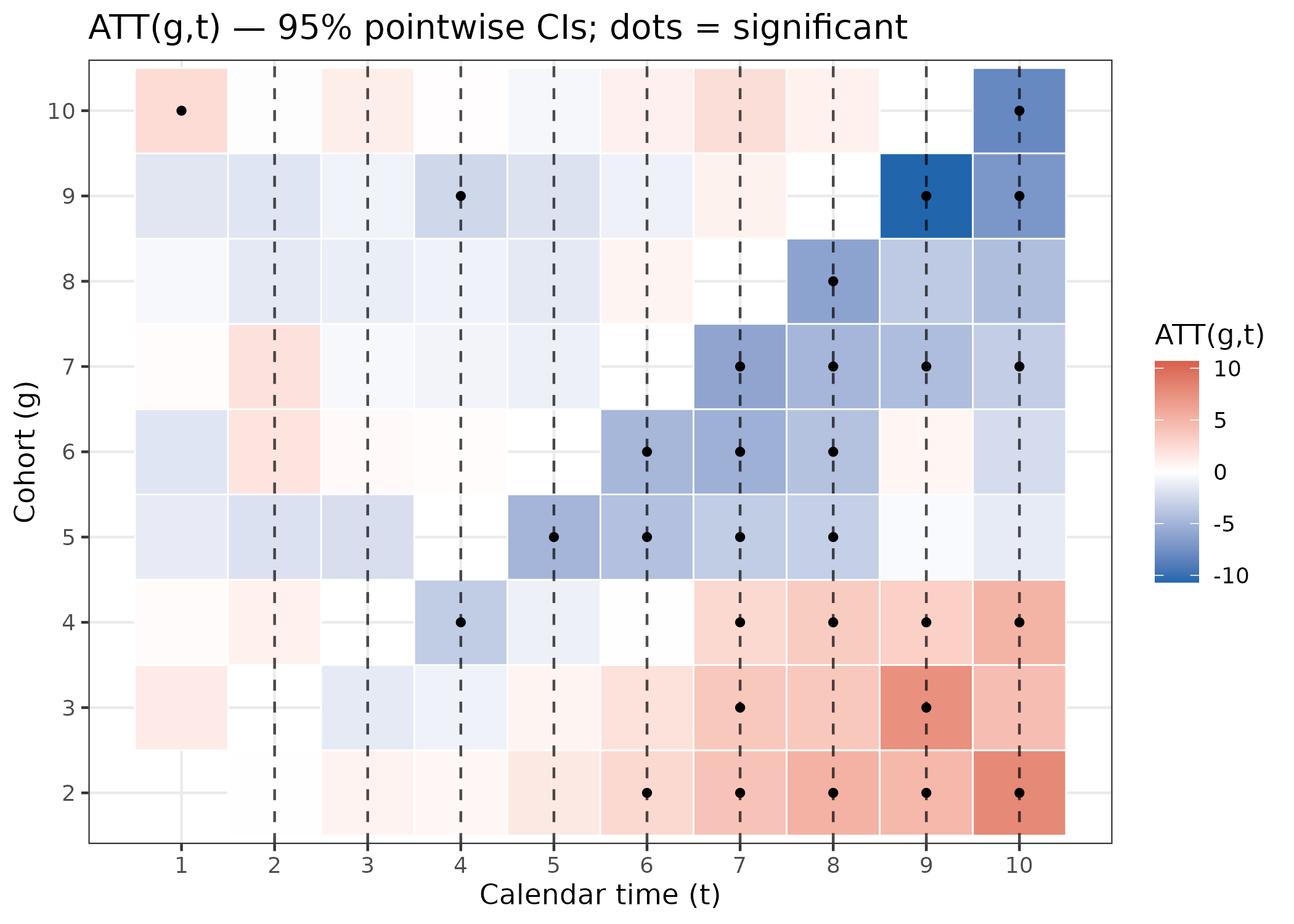
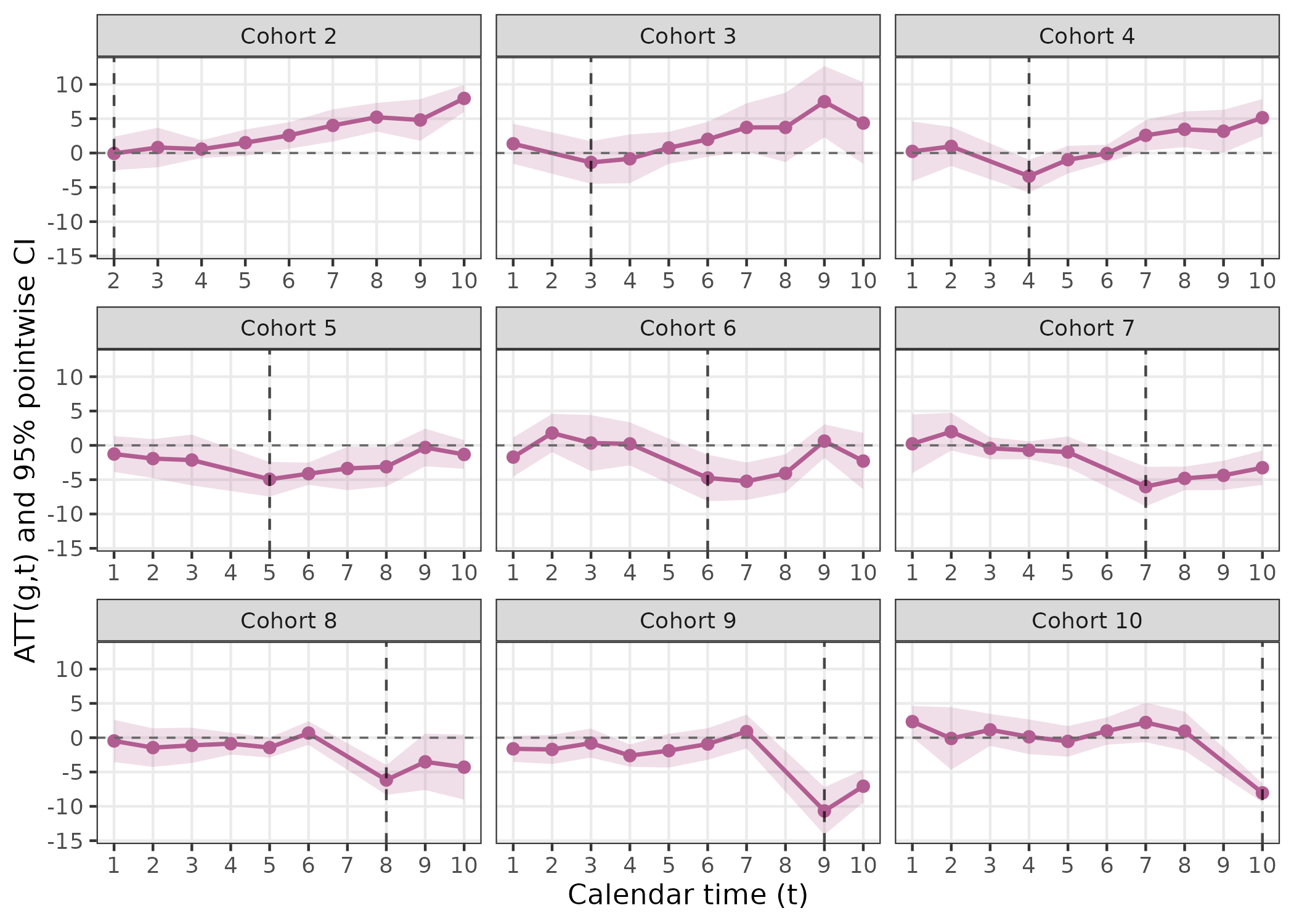
ATT(g,t) visualization
The CS estimator produces a separate ATT estimate for every (cohort
g, calendar period t) pair. Extract the full matrix with
att_gt() and plot it.
Conclusion
The fixes package streamlines event study estimation and visualization for panel data researchers. With a minimal API, multiple CI support, and robust visualization, it accelerates the workflow for dynamic treatment effect analysis.
For further details and full argument documentation, see:
?event_study
?att
?did
?plot.es_result
Happy analyzing!